The little things can say a lot about you– and that goes for your paint choices too! Your choice of commercial interior painting colours isn’t just about aesthetics. It’s a powerful tool that influences how people perceive and connect with your business.
But, choosing paint colours that truly embody your brand’s identity feels like a huge commitment. I totally understand! That’s why we’re here to discuss how to choose the right colours for your brand.
Understanding Your Brand
Before jumping in we have to get back to the basics. Let’s understand your brand at its core. Your brand’s identity is the visual personality of your business. It’s what helps you distinguish yourself as a unique company that consumers want in on. What does your brand stand for? What’s your mission? What makes your brand unique?
The exciting part is that interior design is like the visual storyteller of your brand identity. When done right, it brings your brand’s values, mission, and personality to life within your physical space.
The Psychology of Colours in Commercial Interior Painting
Commercial interior painting colours are about so much more than just what looks pretty on the walls. it’s about understanding the psychology of colours and how different hues also have the power to influence emotions, perceptions, and behaviours.
Our brains naturally associate colours with different feelings. Red might create a sense of urgency and excitement, while blue oozes calm, trust, and dependability. Additionally, green means growth, yellow feels like positivity, and purple screams luxury and loyalty. Use this understanding to your advantage when picking commercial painting colours that convey the right emotions to your customer base.
So, What’s Trending in Commercial Interior Painting?
The interior design world is constantly evolving, so keeping up with the latest colour trends helps keep your brand ahead of the competition. Some popular commercial interior painting trends right now include:

- Earthy Tones: Natural and earthy colours like warm terracotta, olive green, and sandy beige– it only feels natural!
- Bold Blues: Deep, moody blues have taken the spotlight in commercial spaces. This colour exudes trustworthiness (that’s got your brand written all over it).
- Soothing Pastels: Soft pastel shades lend a sense of tranquillity and relaxation to various spaces– it gives your logo the space to shine!
- Muted Neutrals: You really can’t go wrong with creamy whites, soft greys, and warm taupes– their versatile backdrop means these colours match literally any brand.
- Vibrant Accents: Small bursts of vibrant accent colours are being used to add sparks of energy and enthusiasm to spaces.
The Magic of the Colour Wheel
The colour wheel is truly your best friend when it comes to creating a unified colour scheme. Its arrangement isn’t random as it follows a logical sequence. The primary colours – red, blue, and yellow – form the basis of the wheel. Secondary colours, like green, orange, and purple, are created by mixing two primary colours. Tertiary colours come from mixing a primary and a secondary colour.
From here you can find the perfect colour scheme:
Complementary Colours
This scheme pairs colours that sit directly opposite each other on the colour wheel, like red and green or blue and orange. The contrast creates a dynamic and eye-catching effect, making them a great choice when you want to draw attention to your brand’s uniqueness.

Analogous Colours
On the other hand, analogous colour schemes use colours that are next to each other on the wheel, such as blue, blue-green, and green. These schemes create a harmonious, pleasing, and calming effect, making them ideal for the feeling of comfort and unity.
Monochromatic Colours
Lastly, monochromatic schemes revolve around variations of a single colour, including different shades and tints. This creates a sophisticated and unified look, often associated with professionalism and simplicity. So, if minimalism or a clean look is your brand’s thing, this one might be for you.
Branding Through Colours
Your brand should point to your colours and your colours should point to your brand. Think about iconic brands and their signature colours. For instance, McDonald’s can’t be separated from its energetic red and yellow, while Ikea’s specific blue and yellow ooze welcomeness and affordability.
It doesn’t have to be a crazy or revolutionary colour combination. Once you find your brand’s colours stick with them through and through for a cohesive and memorable brand image.
The Nitty-Gritty: Practical Considerations
Practicality should meet style when it comes to commercial interior painting. Beyond the vibe of your brand, it’s important to think about the space you’ll actually be painting when choosing your colours. Don’t forget to consider:
Size Matters
Size really does matter when choosing paint colours for your business space. For cozy, compact spaces, lighter colours can work wonders. They create an illusion of openness, making your space seem more extensive and inviting. But in spacious areas, darker or richer colours can add warmth and create a more welcoming atmosphere.
Lighting Conditions
Additionally, the type and amount of lighting in your space can dramatically impact how colours appear. If you’re working with a lot of natural light the possibilities are endless. Vibrant, bold hues can shine in the sunlight, creating an energetic ambience. However, for spaces primarily lit with artificial lighting, you might need to be more cautious. Some colours can appear differently under artificial light, so it’s essential to test how they look in your specific setup.
Type of Business
The type of business you run should also guide your colour choices. Corporate offices are probably better suited for calming neutral tones to match professionalism, while retail stores could benefit from brighter more engaging colours to draw people in.
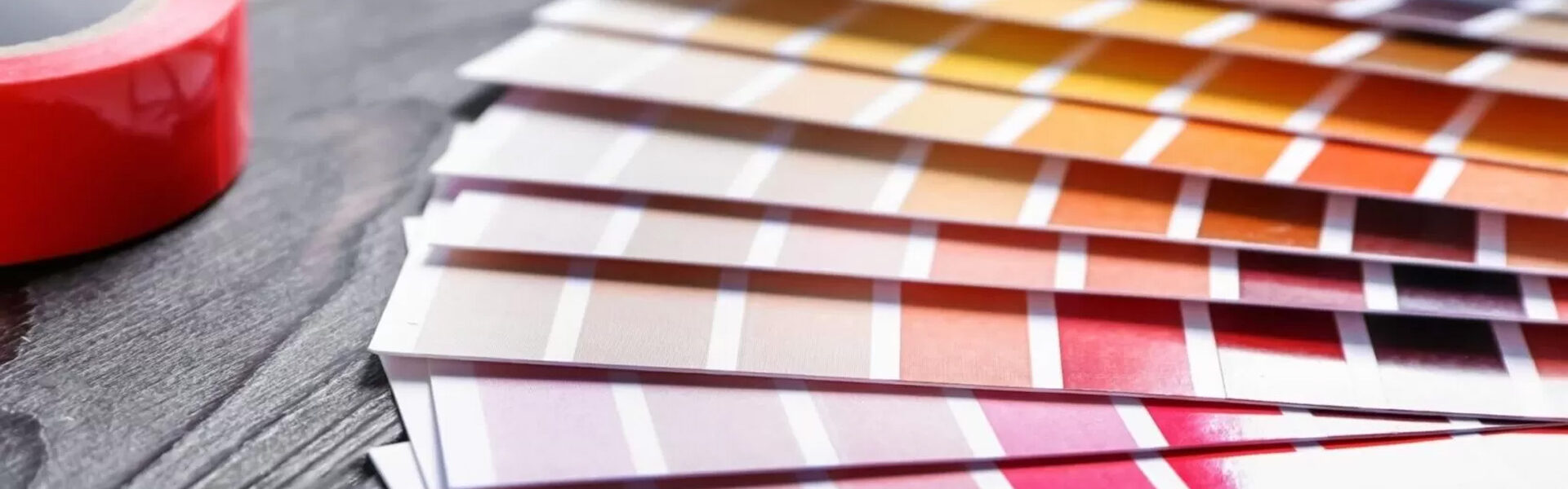
Sample, sample, sample!
Seeing is believing so let’s start colouring! To get those creative juices flowing, we’ve put together some sample colour palettes for different business types depending on your needs. (Include fun visuals or colour swatches)
Also, don’t forget to try it before you go all in with your commercial interior painting colours. Test your chosen colours with swatches in your actual space and get feedback from your team or customers before committing completely.
DIY or Go Pro?
Choosing the right paint colours to reflect your brand identity can be an exhilarating journey, but it doesn’t have to be a solo one. Sometimes, the expertise of professionals can be your greatest ally.
If you find yourself overwhelmed by choices or unsure how to translate your brand’s personality into a colour palette, it might be time to consult a professional. A commercial painting company may offer a level of precision and efficiency to make a significant difference, especially in large spaces.
DIY
Pros:
- Money Saving
- Gives you total control
- Creative endeavour
Cons:
- Time-consuming
- Physically demanding
- Struggle to get professional details right
Hiring Professionals
Pros:
- Expertise (been there, done that)
- Efficiency & accuracy
- Start-to-finish management
Cons:
- May come at a higher cost
- New people who may not understand your vision (if they don’t ask the right questions)
Remember that while DIY painting can save you some bucks, it may not be suitable for every situation. In the case of extensive or intricate designs, or if you’re seeking a truly professional finish, it’s wise to invest in experts who can make your vision a reality!
Let JDavis Paint Your Brand’s Story Today
Ultimately, the power of commercial interior painting is all about bringing your brand’s identity to life. Your choice of paint colours shapes how customers perceive and connect with your business. That’s why you deserve a commercial painting company that reflects YOU!
Our team at JDavis offers a range of commercial painting services that are made to bring your visions to life. We know that a good paint job is everything, and we want to give you the world (cause your brand identity is just that good). So don’t hesitate – get in touch to find out how we can paint your brand’s story together!